Back to work
Case Study · OrangeNXT · 2023–2024

FROM CHAOS
TO CLARITY

Two design systems. No source of truth. A soft launch that exposed everything. This is how a banking app for Nepal's next generation went from internal chaos to something users could actually trust.

10
Days to redesign
7
Users tested pre-launch
2
Years on this product
Role
Lead Product Designer
Scope
Onboarding redesign
Company
FoneNXT / F1Soft
Launch
24 Jan 2024
NXT
01
The situation I walked into

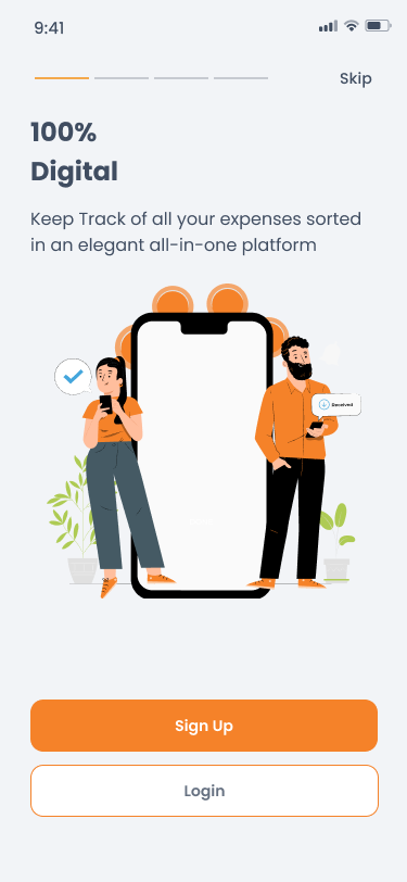
I JOINED AFTER THE PRODUCT WAS ALREADY BUILT.

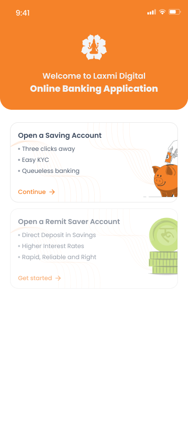
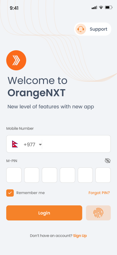
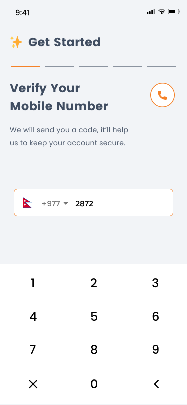
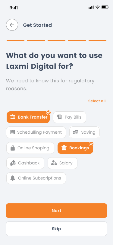
OrangeNXT is a next-gen mobile banking app for Millennials and Gen Z in Nepal — bank from your phone, no branch visit. When I joined Fonenxt as Lead Product Designer, two incomplete design systems ran in parallel. Every screen felt like a different product.

I raised the design overhaul multiple times over months — never a flat no, never a yes. Always one feature away from being prioritised. So I kept building. And I kept watching.

“I could see what needed to happen. The whole thing needed to be rebuilt from a single foundation.”
MY ROLE
01
Direct access to CEO & PO
No middle management — decisions at the table
02
Design team of 3
Structured by strength: interaction · illustration · animation
03
End-to-end ownership
Research · system · screens · handoff
04
2 years on this product
From chaos to public launch
02
The moment everything changed

SOFT LAUNCH. REAL USERS. UNCOMFORTABLE TRUTHS.

We soft-launched 15th October. I ran usability testing — 7 participants, structured scenarios. What they showed us was uncomfortable. I brought the data to the CEO and PO. The testing gave us the language to finally act.

RESEARCH PARTICIPANTS · 7 USERS · MODERATED SESSIONS
Soniya
— Add profession —
Shikha
— Add profession —
Reshma
— Add profession —
Sandeep
— Add profession —
Bigyen
— Add profession —
Saugat
— Add profession —
Mahima Suvedi
— Add profession —
Drop-off risk
Multiple users retook their selfie 2+ times. The camera frame was unclear — nobody knew if they were doing it right.
Soniya · Shikha · Reshma
Confusion
FATCA and PEP declarations were skipped by almost everyone. Nobody knew what those words meant.
Soniya · Sandeep · Reshma
Trust gap
One user photographed the wrong document. Camera guidance wasn't clear about what it needed.
Reshma
Silent decline
Location permission routinely declined. No one knew why a banking app needed their location.
Shikha · multiple
Form aversion
"I don't like filling forms." Cards felt less intimidating — familiar, less like paperwork.
Bigyen · multiple
OCR win
Auto-extraction positively received. "Felt like a real banking system" — trustworthy.
Saugat
“Information was not disseminated properly — I didn't know what was expected of me.”
03
What we assumed vs what we found

WE THOUGHT IT WAS A VISUAL PROBLEM. IT WAS A TRUST PROBLEM.

Before testing, the assumption was inconsistent UI — fix the design system, fix the app. The testing reframed everything. What was killing users was silence. Every sensitive request arrived without explanation. For a banking app, silence reads as suspicious.

“You can't fix trust with components.”
NORTH STAR
ANSWER THE QUESTION BEFORE YOU ASK ONE.
Every screen had to answer the question the user was already asking — before asking anything of them.
04
The sprint

TEN DAYS. EVERY DECISION COUNTED.

My window for onboarding was roughly 10 days before handoff to development. We started with the design system, not screens — one system, one source of truth, one tone of voice. I structured the team around strengths: interaction, illustration & microanimations, sequential phases.

The moment we nearly lost the most time was the dashboard. All four of us had ideas and started building simultaneously. Divergence has a time limit in a sprint.

Sprint Workshop
Sprint Workshop · User story mapping
The team mapped out user stories together — where users got confused, what assumptions we were carrying, what needed to change.
Sprint Planning — Onboarding UX Calls
Sprint Planning · Onboarding UX calls
MPIN, biometrics, permissions — every sensitive request mapped before a single screen was drawn.
Sprint Planning — KYC Breakdown
Sprint Planning · KYC screen breakdown
Fallback states, error messages, edge cases. Not just the happy path — every exception had to be designed for.
Sprint Planning — Full UX Flow
Sprint Planning · Full UX flow
Onboarding to Products — the full user journey charted in one session. This is where the scope became real.
Team Board — Kanban
Team Board · Kanban snapshot
Shipped, WIP, In Review. Every screen tracked as a card. No ambiguity about what was done.
Team Board — Updated
Team Board · Moodboard + prototype added
Visual direction and prototype link added so engineering could reference the interaction model directly from the board.
Problem Statement
Problem framing · Why users got lost
The root cause wasn't visual — it was a trust and communication problem. This framing changed everything.
Paper Sketch
Paper sketch · KYC document step
Quick wireframes for document selection and overview. Cheap enough to throw away, clear enough to align the team.
Whiteboard — OCR Form
Whiteboard · OCR form layout
Personal info and document info as separate cards. The layout engineering pushed back on — evidence won.
Whiteboard — OCR Fallback
Whiteboard · OCR fallback flow
What happens when OCR fails? Bottom sheet, manual entry, fallback states — all mapped before a pixel was pushed.
Whiteboard — Home Dashboard
Whiteboard · Home dashboard navigation
The dashboard navigation sketch — where all four of us started building simultaneously and nearly lost the most time diverging.
05
The decisions — and the fights

FIVE DECISIONS. NONE OF THEM EASY.

Each traces back to something a user showed us — and each involved real friction with engineering or the product team.

01
The overlay vs the full screen
Research: highest drop-off · users arrived unprepared

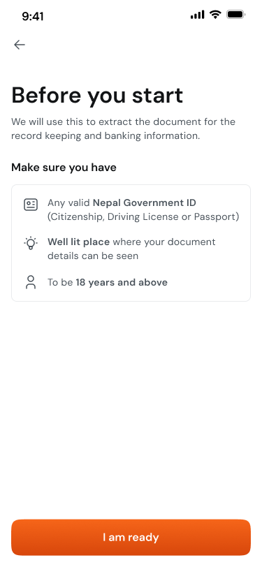
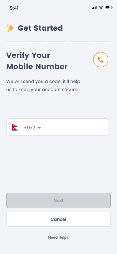
The product team wanted an overlay on the camera screen. My argument: an overlay competes with the camera UI, gets dismissed quickly, and doesn't give the message space to land.

We pushed for a dedicated full screen — “Before you start” with three clear requirements. Simple, scannable, impossible to miss.

It added one screen. It removed the single biggest drop-off point.
Before you start
Full screen — not an overlay. User confirms before the camera opens.
02
The permission nobody had questioned
Research: location routinely declined · selfie anxiety

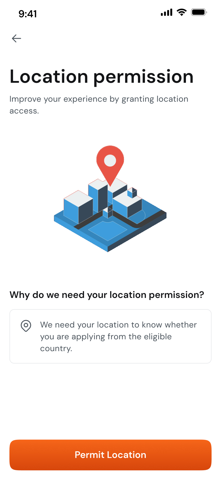
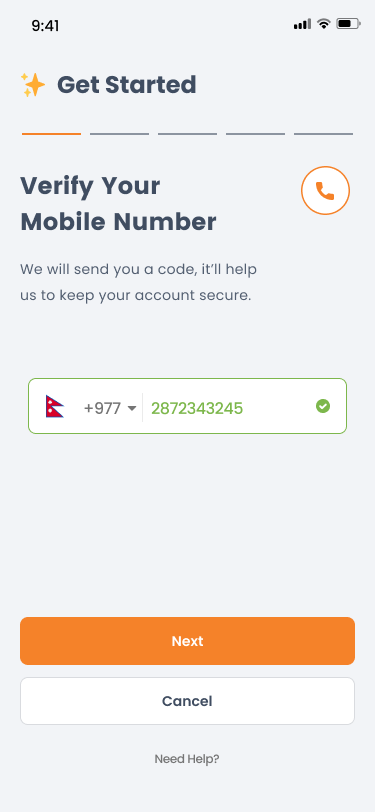
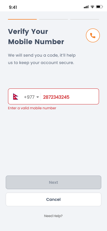
Location permission was declined by almost everyone — no one explained why the app needed it. We added an explainer before every sensitive request: location, selfie, document. Same principle, applied consistently.

Never ask for something sensitive without earning the right to ask.
Location explainer
Selfie explainer
Location — why
Selfie — why
Explain before you ask. Applied to every sensitive request.
03
The form nobody wanted to fill
Research: form aversion · engineering pushed back hard

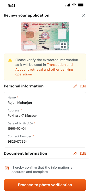
Engineering pushed back on card layout — API dependencies made it complex. We tested with new interns who had zero prior exposure. Majority preferred cards — not because they looked better, because they felt less like paperwork.

Evidence ended the argument.

Evidence ends arguments that opinions never can.
Review application
Card sections — personal + document info, each independently editable. OCR auto-fills.
04
The forced step that was already there
Inherited: mandatory biometrics · no skip option

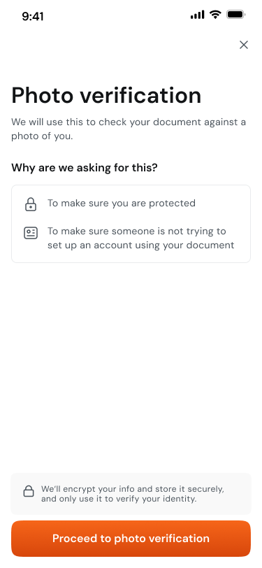
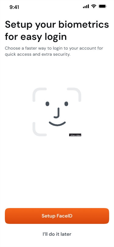
Inherited mandatory FaceID with no skip. Three changes: added “I'll do it later”, reframed as a benefit not a requirement, added a microanimation to make it feel human rather than clinical.

Sometimes the most important design skill is letting evidence do the talking.
Biometrics setup
“Easy login” framing. Microanimation. “I'll do it later” — the skip that didn't exist.
05
The compliance constraint we designed around
Research: users felt deceived discovering limits after signup

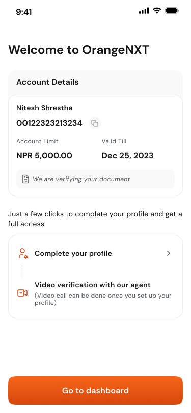
NPR 5,000 temporary limit until verification. The previous design hid this — users discovered it after finishing onboarding. A constraint discovered by accident is a betrayal.

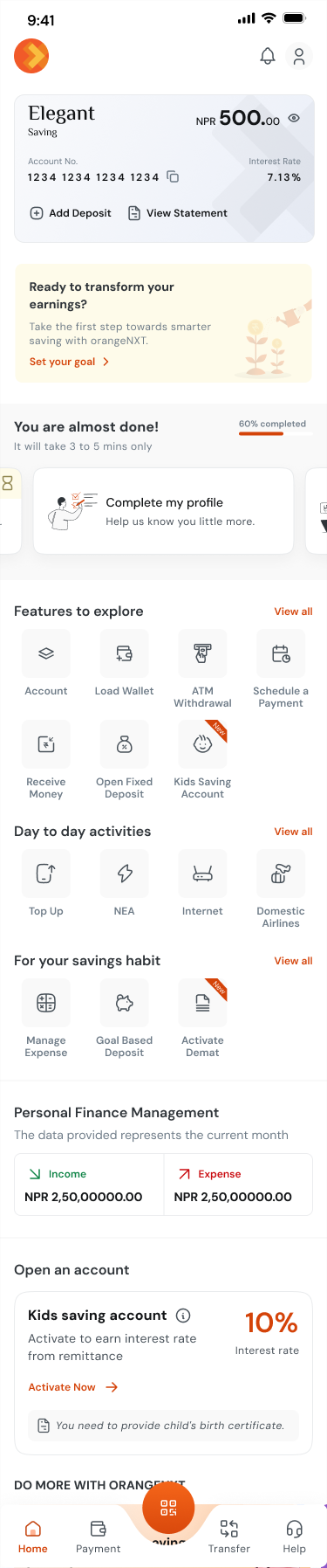
We showed the limit immediately after account creation, then added a “60% completed” dashboard nudge to keep momentum. Borrowed from gaming, applied to banking.

Transparency at the right moment builds more trust than silence ever could.
Profile completed — limit shown
Dashboard — you are almost done nudge
Limit shown
You're almost done
Onboarding doesn't end at signup. It continues on the dashboard.
05b
Before & after — explore both flows

TWO FLOWS. NAVIGATE EACH INDEPENDENTLY.

The old flow had 14 screens including 4 generic walkthrough slides before signup. The redesign has 30 screens, each earning its place.

BEFORE
Walkthrough — Personal FinanceWalkthrough — Wealth ManagementWalkthrough — Utility PaymentsWalkthrough — 100% DigitalSplash screenTerms & conditionsPhone — emptyPhone — enteringPhone — validOTP — emptyOTP — enteringOTP — validCreate PINConfirm PIN
Walkthrough — Personal Finance
1 / 14
VS
AFTER
Splash screen — frame 1
Splash screen
1 / 20
WHAT WAS WRONG

4 generic walkthrough slides before signup. No brand, no trust. Users arrived at every sensitive step cold — no context, no explanation.

WHAT CHANGED

Every sensitive request explained before asking. “Before you start” eliminates the biggest drop-off. Trust built screen by screen, not assumed.

06
What happened next

ONBOARDING DONE RIGHT.

We didn't have clean before metrics — the soft launch was the first time real users touched the product at scale. Our baseline was observation: users abandoning mid-flow, photographing wrong documents, hesitating at every sensitive request.

The NPR 2 crore transaction target wasn't hit in the first month — onboarding conversion alone doesn't guarantee transaction behaviour. But 960 monthly users was cited by the CEO at a company town hall. The redesign did what it was scoped to do.

The design system built for this project became the foundation for the entire OrangeNXT product.

3,084
Users onboarded soft → public launch
76%
Monthly conversion rate
960
New users / month, growing
07
What I still think about

THE WORK I DIDN'T FINISH.

LOOKING BACK

This project taught me that the hardest design problems in fintech aren't the UI ones — they're the trust ones. Every screen where a user hesitated wasn't a layout problem. It was a communication problem.

If I were starting over, I'd push harder on the FATCA and PEP declarations. We improved the framing but didn't go far enough. The right solution was to replace legal jargon with plain language entirely.

I'd also advocate for a progress indicator across the full onboarding flow — not just the post-signup dashboard. Users in testing often didn't know how far they were from completion.

“The design still isn't accessible to everyone — not for users with visual or hearing impairments, or people in remote Nepal who can't read or write. A banking app that claims to democratise finance but only works for the literate and able-bodied hasn't fully solved the problem. That's the next version of this work.”