AI DOESN'T NEED
TO BE PERFECT.
When AI makes a mistake, the UX needs a plan. mAI Food didn't — and that was the real problem. This is how I redesigned a broken kiosk experience from the inside out.
AN AI PRODUCT WITH NO PLAN FOR FAILURE.
mAI Food is an AI-powered POS product built by izy for corporate cafeterias. It uses a camera to detect food items on a tray and generate a bill automatically — reducing manual input and speeding up checkout.
I was the lead designer, employed by Resimator and embedded within izy's product team. I owned the end-to-end redesign of a broken v1: the AI detection existed, but the UX around it — the feedback, the fallbacks, the edge cases — had no clear design thinking.
EVERY AI FAILURE BECAME A UX FAILURE.
When I mapped the v1 screens for the first time, the problem wasn't hard to find. Every screen was solving the same problems differently. No shared language, no consistent feedback logic, no fallback thinking.
Users had no way to tell what the AI was doing — scanning, processing, or stuck.
When detection went wrong, nothing communicated it. Users were left guessing.
No design system. Each screen handled patterns independently.
Items needing weighing were dumped into a list with no sequence or guidance.
No clear path when AI failed. Users and staff were stuck with no obvious next step.
THE CONSTRAINTS WERE THE BRIEF.
Understanding what I couldn't change shaped every decision I could make.
Users were based in Norway. All insights came through written PO notes and tickets. The PO became my primary proxy — I designed from patterns in feedback, not direct observation.
I couldn't change how the AI detected items or its confidence thresholds. Failure states were not edge cases — they were core flows.
v1 had no shared component library. Every screen had drifted independently. I had to establish new patterns while simultaneously redesigning the product.
THREE PATTERNS. ALL POINTED THE SAME WAY.
Without direct user access, I built my understanding from PO notes and support tickets, an audit of v1 screens, and a discovery workshop I ran with the cross-functional team.
Busy office worker. Picks up food quickly between meetings. Low tolerance for friction or confusion. Drove the primary design decisions.
Canteen staff. Manages 100+ employees daily. Needs reliable tools. Steps in when the system fails users. Informed fallback and manual mode flows.
FIVE DECISIONS. ALL FROM THE SAME QUESTION.
Every decision came back to one thing: what does the system communicate when it isn't sure?
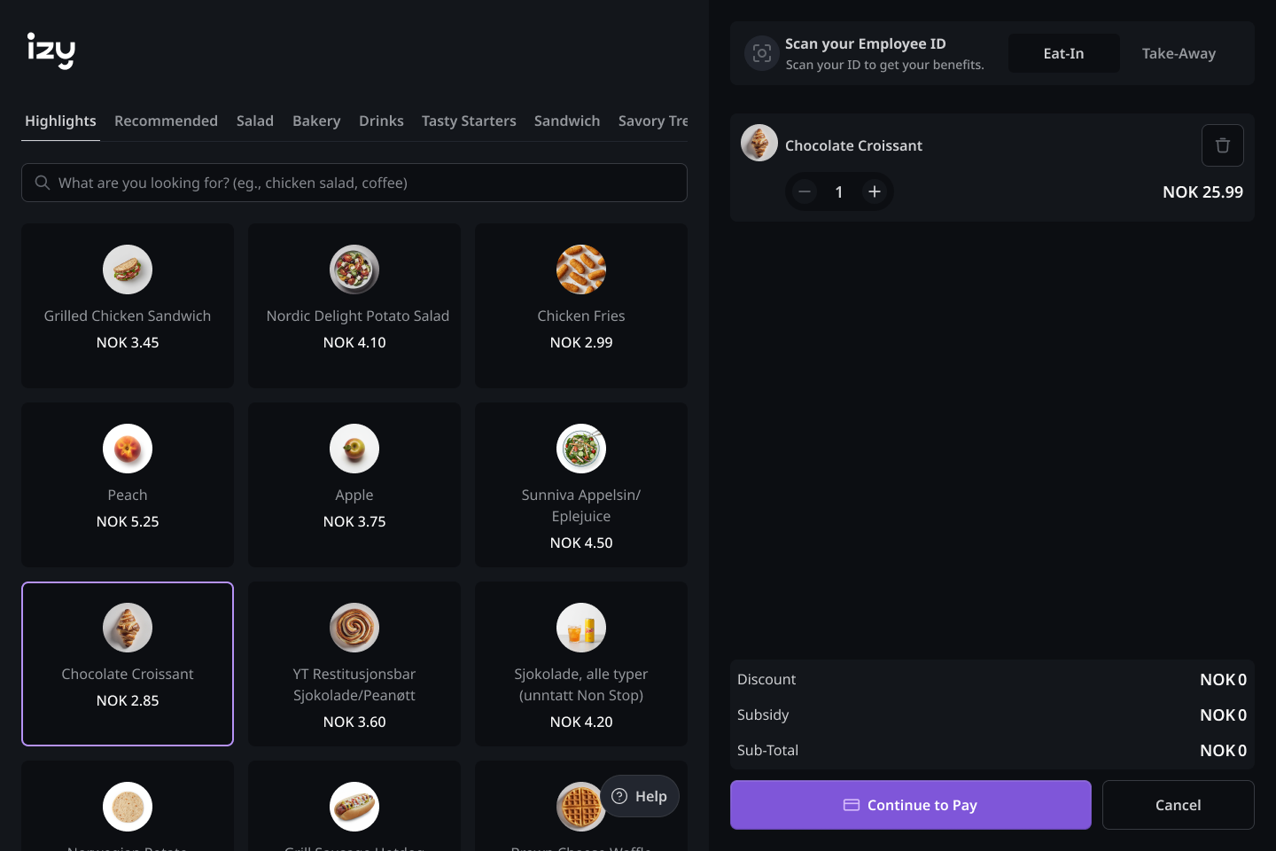
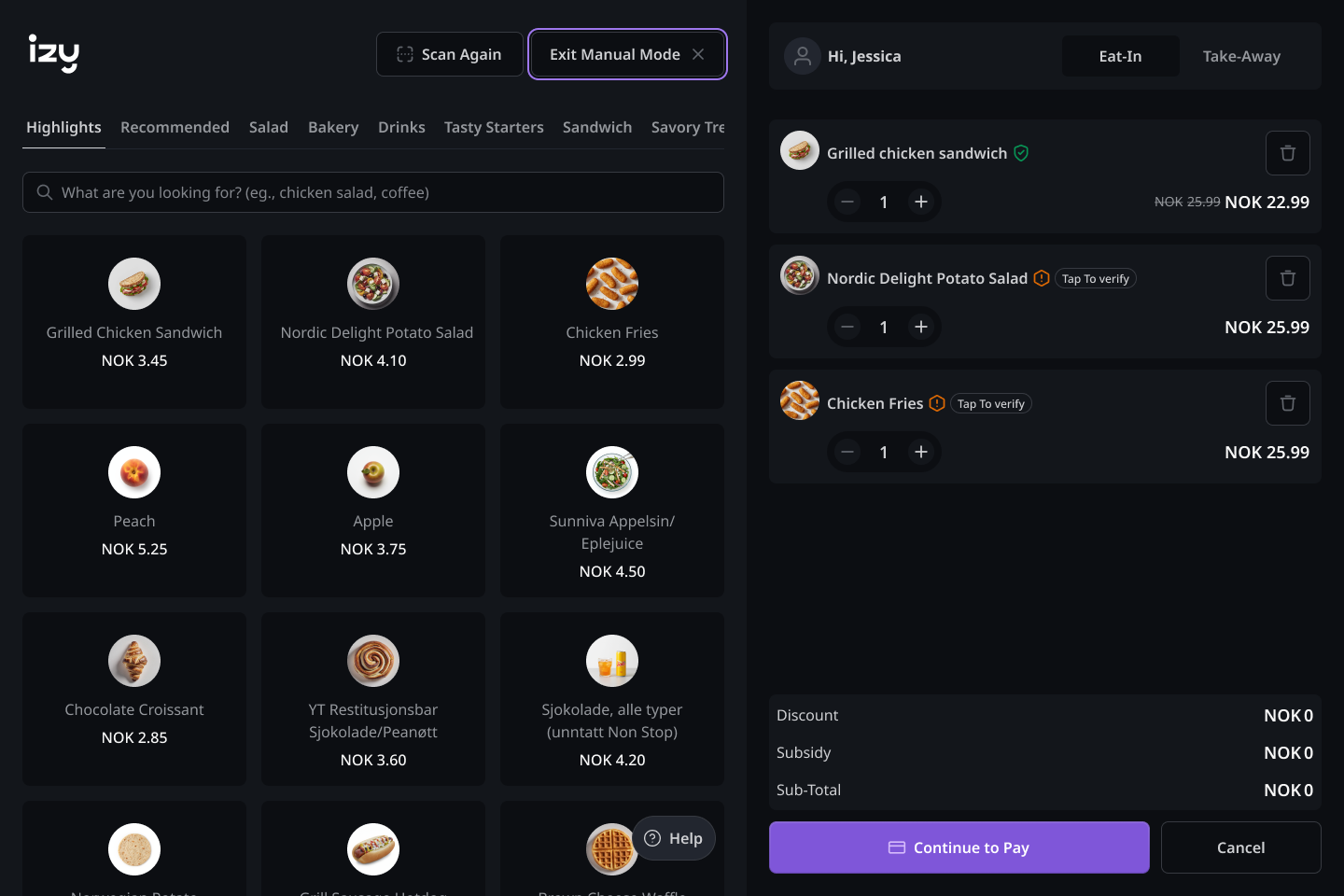
When the ML team flagged a low confidence score, the temptation was to auto-switch users to manual mode. I rejected this — an abrupt mode switch feels like a failure. Instead: an orange warning on the detected item with a “Tap to verify” prompt. High-confidence items confirm automatically with no interruption.
In v1, AI failures produced silence. No message, no next step, no guidance. I mapped every possible AI state and designed an explicit response for each — not as afterthoughts, but as first-class flows built into the core interaction model.
v1 dumped all weighted items into a list with no sequence and no guidance. I replaced it with a modal-driven sequential flow: one item at a time, with a clear physical instruction and a live connection to the order list.
Both a contextual prompt and a persistent trigger — never forced, always available. Smooth to enter, smooth to exit. v1 comparison: hidden with no clear trigger. Redesign: always surfaced at the right moment.
AI scanning interaction, manual mode flow with microinteraction, and the order list component — documented and adopted by the team in ongoing development.
SIX MOMENTS. ONE GOAL.
The redesigned flow covers six key moments — from the first instruction a user sees to checkout. The system should always have something useful to say, whether the AI is working or not.
Clear instruction before any action. Removes scanning sequence confusion — users know to place food first, then press scan.
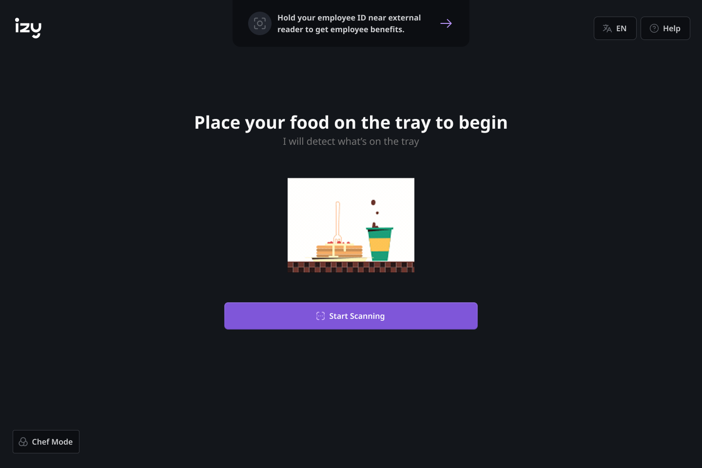
Clear instruction before any action — place food on tray, then press scan.
Green = high confidence, auto-confirmed. Orange = low confidence, prompts a tap to verify. Colour carries meaning — the user decides, the system doesn't decide for them.
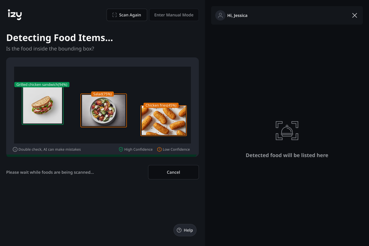
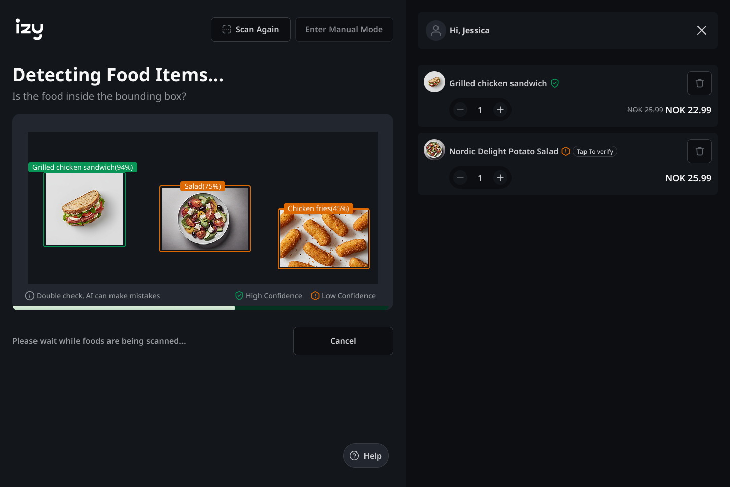
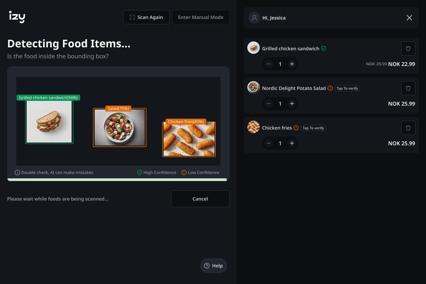
Initial detection → order builds → orange items flagged for verification. Colour carries meaning at a glance.
One item at a time. A clear physical instruction, sequential guidance, and a live price update directly connected to the order list.
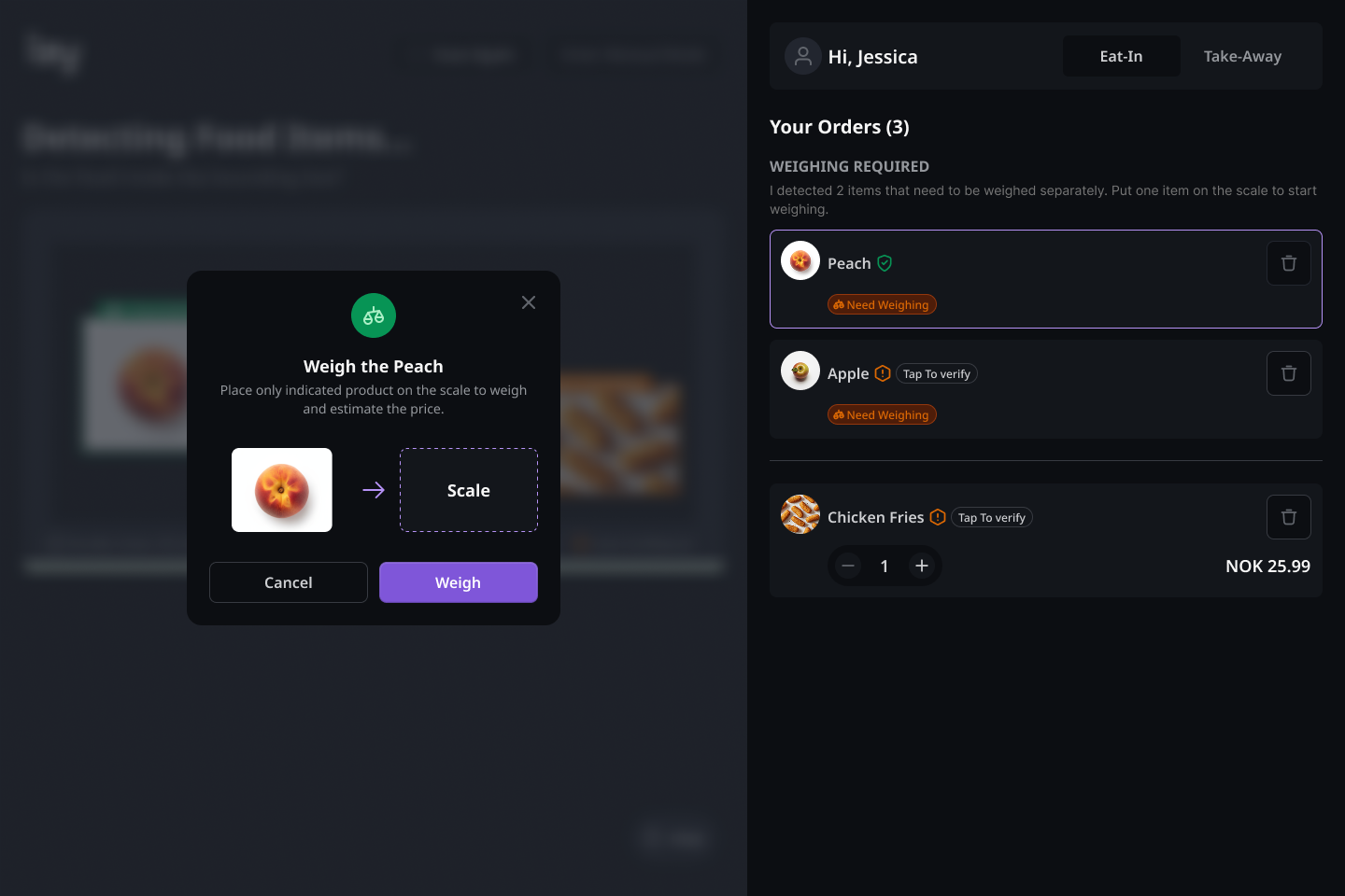
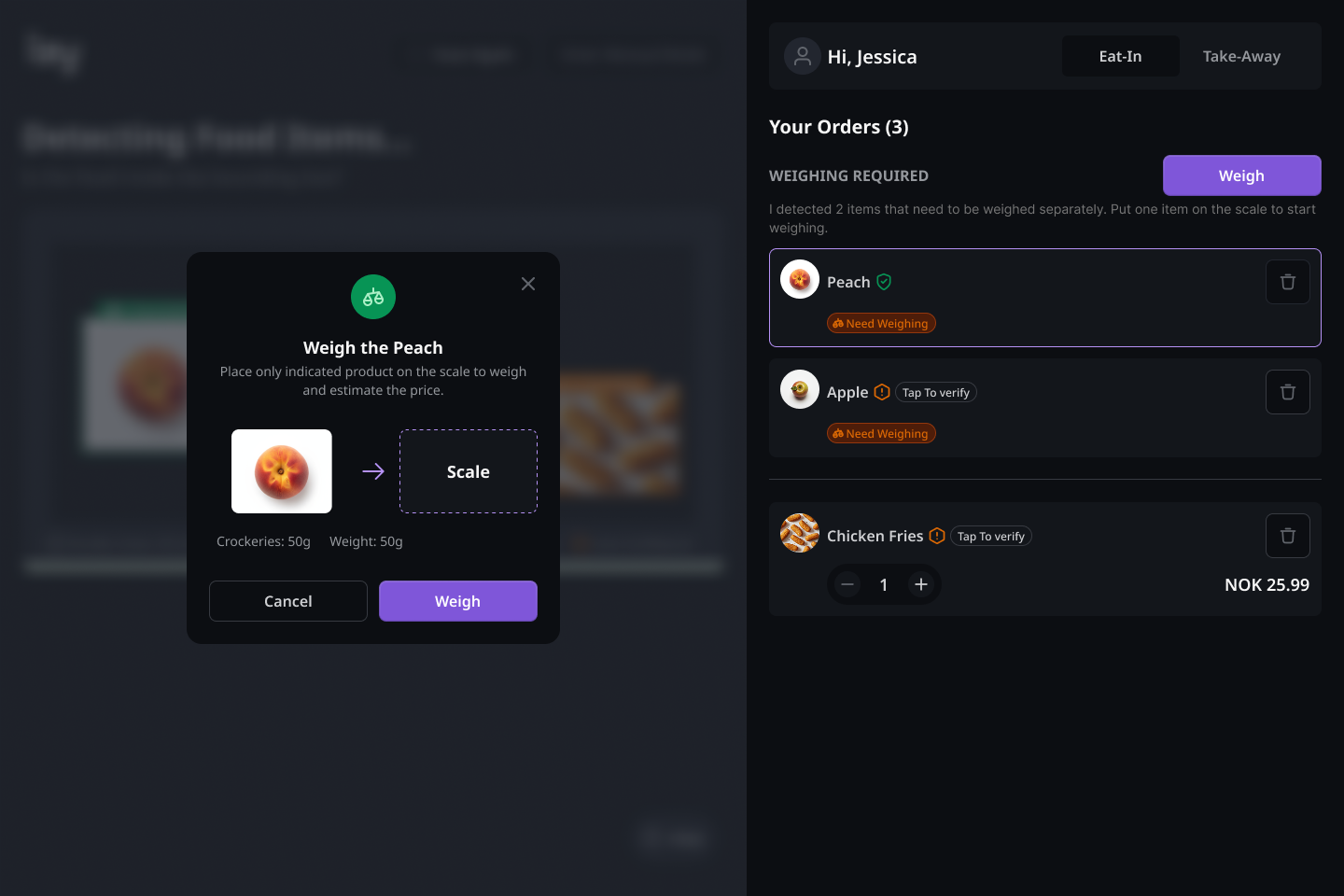
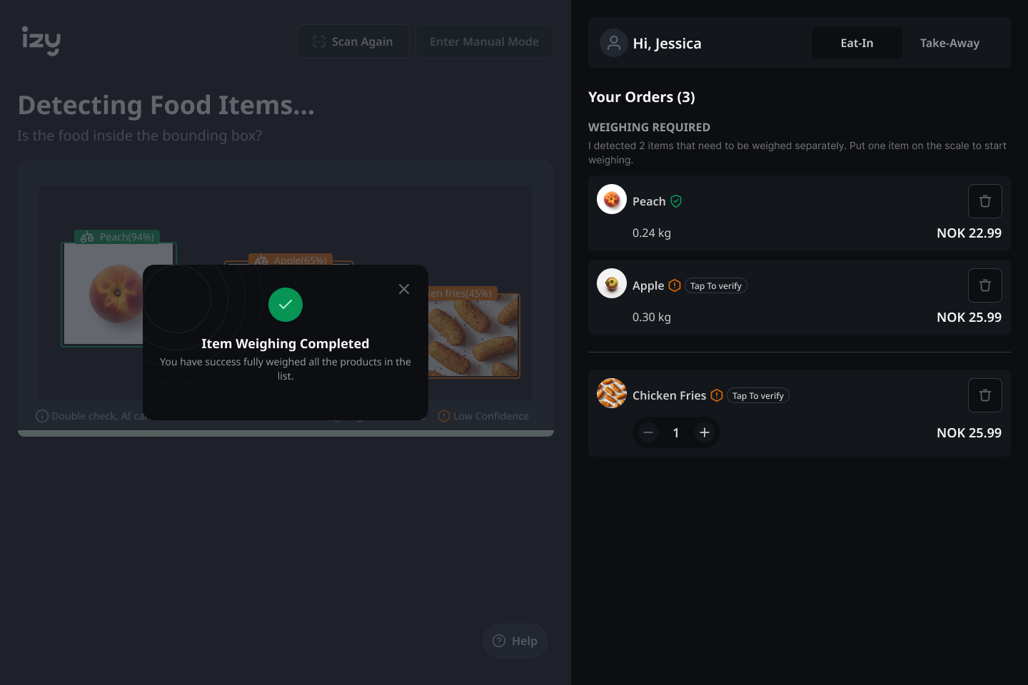
Weighing required → modal guides one item at a time → completion confirmed. Sequential, never ambiguous.
Contextual prompt and persistent trigger. Never forced, always one tap away — smooth to enter, smooth to exit.
Browse freely, exit cleanly. Manual mode is always one tap away — never forced, never abrupt.
MVP SHIPPED. DATA STILL EARLY.
The MVP shipped. User data is still early — these outcomes are observational, based on PO feedback and team observation. I'm not claiming metrics I don't have.
The design system built for this project became the foundation for the team's ongoing development.
THE WORK I DIDN'T FINISH.
LOOKING BACK
I'd push for user-driven AI annotation from the start. The Tap to Verify pattern was good for communicating uncertainty — but it's still reactive. What I really wanted was a model where users actively feed the AI when it fails them — making the system smarter with every interaction.
Designing for AI uncertainty taught me to treat every failure state as a design opportunity, not a fallback. Proxy research demands more rigour — working through a PO made me disciplined about finding patterns, not accepting observations at face value.
“Trust in AI is a UX problem. Users don't distrust AI because it's imperfect. They distrust it because it doesn't explain itself. That's entirely designable.”